The logo is our company’s primary visual identifier. It is the keystone of our brand and acts as a visual representation of who we are and what we do. We protect it, use it with care, and apply it consistently and expect teams outside of Cook to do the same.
Before you proceed, be sure to read and comply with our Cook Medical Logo Guidelines for Distributors
Logo Usage Guidance for Distributors document (PDF)
Please note:
The following downloads contain files for print and digital. Our print files are .ai (Adobe Illustrator) CMYK files. Our digital files are .jpg, .png, and .svg files. If you have questions about a file or the application of a logo, email:
Distributors@CookMedical.com
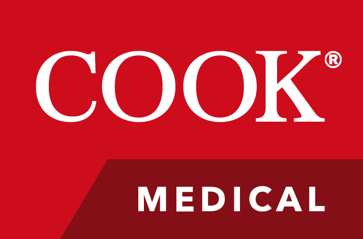
Primary Cook Medical Logo
The red logo is the signature of our brand identity. It gives our marketing pieces an instantly recognizable face and acts as a visual anchor across media. This logo should be your first choice whenever possible.
Alternative Logos
Alternative logos are available for circumstances where a full-color print or display isn’t possible or when the signature logo does not best serve the goals of the design.
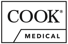
STROKED
Best for watermarks, and complex backgrounds
Click to download
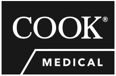
FILLED
Best for single spot color applications, and instructions for use
Click to download
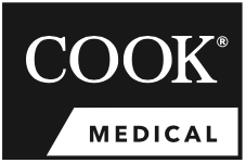
REVERSE TABBED
Best for print materials when full color is not available
Click to download
MONOCHROME
Best for print materials when color is not available
Click to download
Variant logos used for IFUs, packaging, and labeling
Contact Distributors@CookMedical.com if you need to use a variant logo.